Spider-Woman Art

Sunday, July 23, 2006

Dave Cockrum

080606: Here I've added color to the Magnus character and toned down the colors from the original.
072306: Here I added color to the Excalibur character and I was able to consolidate layers reducing the file size from 500MB down to 150MB. The tricky part is with the consolidated layers, I need to make a selection for each of the colors when applying tones.
070306: This classic piece from Cockrum is one of my old time Spider-Woman favorites. In this color vairant, I tried a new technique of using one fill layer with two sub-layers of clipping paths for the red and yellow of SW costume. This enabled me to use the same midtone, shadow and hightlight (other sub-layers) layers for both colors. Look forward to finishing this one up.
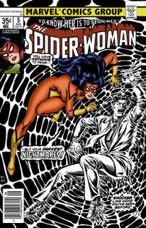
080206: Thanks Mr. Postman for knowing EC is Ernie Chan. I'll have to lookup his other work...He actually did pencils in SW29.
072906: At first, I didn't think this was a Cockrum piece but it is. Still trying to figure out then inker with the initials EC. I was a bit disappointed because the SW's gliders were not include. Probably because of the weird position she is in. Still had fun coloring the piece.

072306: Another Cockrum classic with my favorite inker Bob Wiacek. This cover seems to be a start of trend where SW is tied up or chained up. It's another fun piece, hopefully I'll finish it up.

071006: This is another favorite classic from Cockrum. He really knows how to render SW in an action position. Here I had to redo the shadows a couple of times. Though I may have to mute the colors on the Brother Grimm character since they are a dark blue and red. I want the focus to be on SW.
Brian Postman


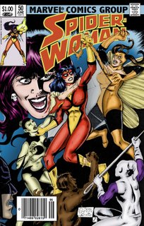
072306: I mocked up this piece from Postman as he indicated that it could have been a variant to SW50. I had to recrop it to fit the cover format. This piece was a little rushed. I may go back to redo some of the colors.
062206: All the color, midtones, shadows and highlights are in. After coloring SW, I kinda rushed the other characters and background. I may go back and do so refining. As I work on other pieces, different techniques improve so I've been going back and forth tryingout different methods.
061406: Here two additional characters are colored and the layers in the Photoshop file are building up and the file is getting larger and larger.
061106: Brian Postman indicated that this could have been a variant of Spider-Woman #50. Here is my attempt to color it. I'm having problems smoothingout the blends for some reason. I may have to apply more blur on the shadows and highlights.
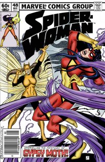
070106: This turned out pretty well. Learned a couple of tricks with making masks and compound paths, but I think I did it the hard way. I literally hand lettered the new banner and the new "avatar" almost had to be resketched electronically.
062806: Here's another Postman recreation of SW48. It was a bit of a challenge coloring the fabric. It took 3 tries and lots of Gaussian Blurs. Still need to recreate the bew banner and "avatar."

Saturday, July 15, 2006

Michael Golden

071506: Michael Golden was very popular in the 80s. And in Avengers Annual 10, we get to see his unique style with Spider-Woman. Too bad he did not do the cover. But here is page 1, with SW's daring rescue of Ms. Marvel. I had to redo the Golden Gate frame. It's somewhat difficult it know detail are on the bride, I had to refer to an actual photo.

Sal Buscema

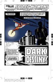
071506: The issue that started it all, Marvel Spotlight 32, Sal Buscema and Jim Mooney really did an incredible job. It seemed back then (1976) Sal Buscema seemed to be one of the major Illustrators for Marvel. In this page 1 re-color, I've decided to give more color details to the shadow images and play with the lighting from the moon. I think it's working pretty good so far.

Sunday, July 09, 2006

Ed Benes


070906: This Benes piece is a beautiful sketch. Though it was not inked, I was able to manipulate the curves and levels to give me enough contrast to color in the sketch. This was a fun piece to do and this would make a great variant for the upcoming new series.

Saturday, July 08, 2006

Joe Sinnott


070806: I was hesitant to do this Sinnott masterpiece, thinking I wouldn't be able to give it justice. I suprised myself again. Though I have a hard time finding a black and white version to color and the SW Essentials had a real bad copy, I had to pull out my CGC 9.8 (my personal rating) SW1 for a high resolution scan. I'll probably go back and clean up the halftone dots some time in the future. But it's looking pretty good so far.

Wednesday, July 05, 2006

Bill Sienkiewicz


070506: The original coloring of this Sienkiewicz piece had a blue, yellow and orange tri-tone which is uniquely different. Though I've always wanted to see a variant in full-color with an over exposure of highlights to exagerate the light source. I'm pretty much happy with how this has started and it will be interesting how it will look finished.

Sunday, July 02, 2006

Bob Wiacek

070206: I think I originally saw this piece back in the 80s in black and white. I saw it again it Spider-Woman Essentials. It was calling out to me, "color me..." It's a great classic pin-up from Wiacek. This could be another variant for the upcoming new series.

Still need to work out the highlights from the venom blast, but it's coming along quite well.

Saturday, July 01, 2006

Joyce Chin


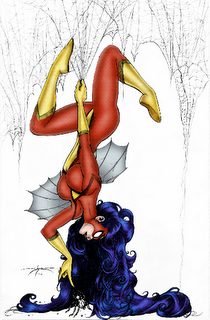
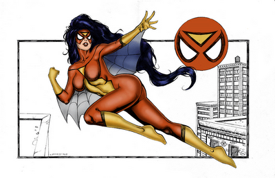
061506: Joyce Chin's sketch is one of my favorite pin ups. Great detailing with the hair and glider webs. I added a violet mid-tone to the hair to enhance much of the detailing. I'm going to attempt to electronically ink the sketch as you can see, it needs it.

Tom Burgos

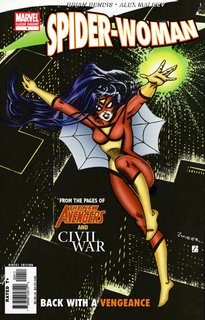
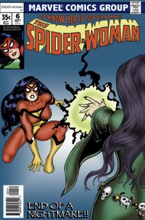
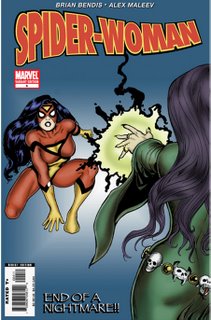
062606: This Tom Burgos piece should have been a variant of SW6. I really enjoyed doing this piece. Only challenge here was Morgan Le Faye's hair. I had to apply blurs to smooth out the shading.
Here's how the Burgos variant would look today.

Marcus To


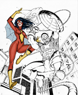
061506: I like the concept here of teaming SW and CA together. Maybe a future title. At the start I applied more highlights and shadows than usual but applied too much Gaussian Blurr and toned it dowm too much and lost the contrast.

Michael Dooney


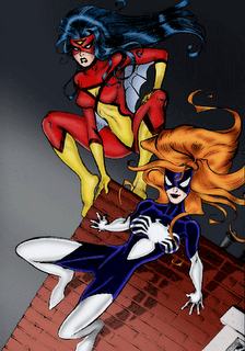
061506: I have all the coloring finished, but the background needs something; possibly some type of texture. Also the brick building needs more color detailing maybe.

061306: This is turning out pretty well considering it was not inked. I may decide later to ink it electronically but not sure it really needs it. And Julia turned out pretty well. Though I need to work on the highlights to make them popout a little.

061106: This Michael Dooney commission piece is a sketch with no inks. Color had to be removed and contrast had to be applied to darken up the sketch. Here I finally used a wacom tablet and what a difference. It was easier to use and probably took my half the time if I was using a mouse or trackball. Here my highlight need a little work but over all I'm happy with it. Can't wait to finish it up.

Jones


061706: In this sketch by artist Jones, I created a layer to fill the black areas since this piece is not inked. I may consider inking this piece as well.